Our Three Step Process
Our Three Step Process
Logo Design Case Study: The Tulip - Feel Like Home
Our Three Step Process
Logo Design Case Study: The Tulip - Feel Like Home
The Tulip - Feel Like Home is a boutique hospitality brand that blends comfort, elegance, and local charm. Designed to offer travelers a warm, homely experience in stylish accommodations, The Tulip targets modern nomads, families, and professionals seeking a restful yet premium stay.
Challenge:
The client approached Rawdify Digitals with a clear brief: craft a brand identity that reflects the essence of a cozy, welcoming space with a touch of elegance and femininity. The logo needed to evoke a sense of calm, comfort, and personal connection, qualities core to their hospitality promise.
Solution:
To truly capture the spirit of “feel like home,” we followed a strategic yet creative approach grounded in emotional branding:
1. Discovery & Brand Personality Mapping
We began by understanding The Tulip’s target audience, service ethos, and desired perception. The brand was defined by three core traits: warmth, sophistication, and serenity. This helped us anchor the visual tone and symbolism.
2. Concept Development
Several conceptual directions were explored:
Nature & Florals (symbolizing care and softness)
Minimalist Luxury (to position the brand as boutique and refined)
Home Iconography (to subtly reflect comfort and belonging)
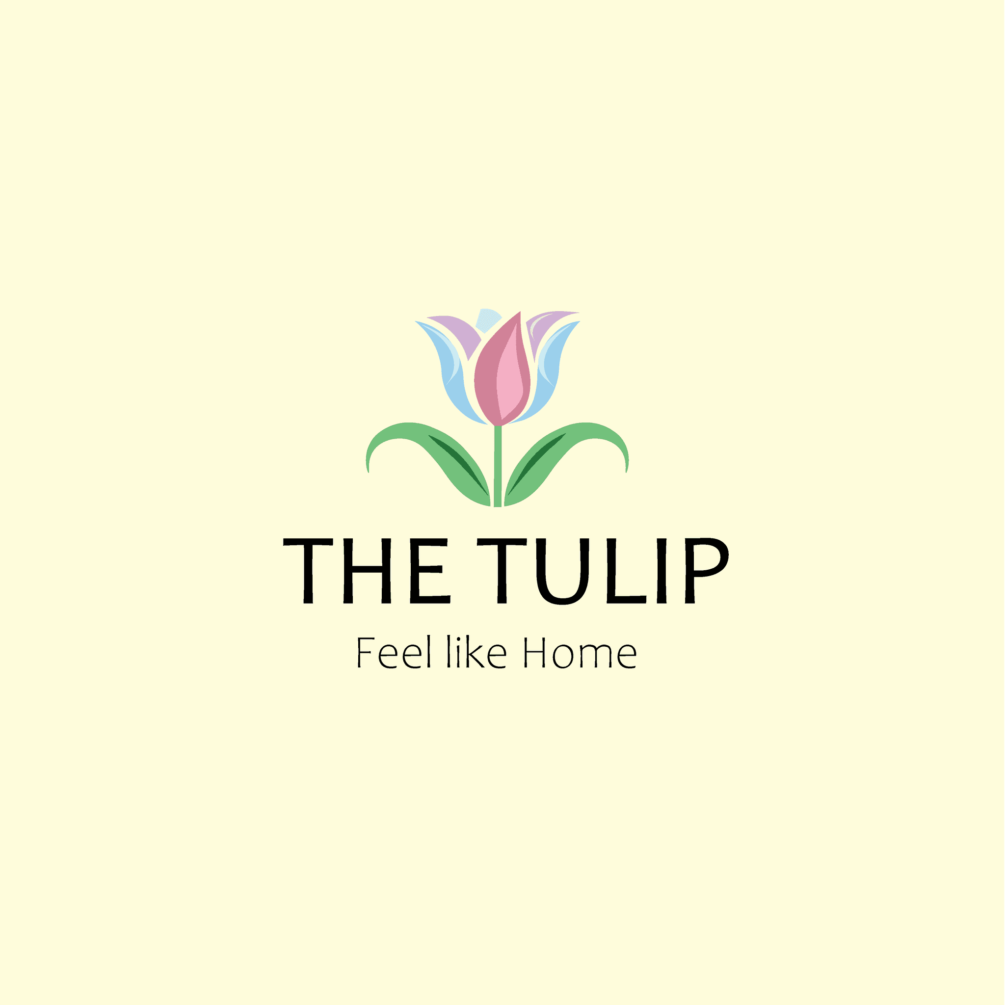
After rounds of sketching and mood-boarding, we landed on a concept that combined a stylized tulip flower with soft, flowing lines forming a welcoming shape, almost like open arms or a house silhouette.
3. Typography & Color Palette
Font Choice: A custom serif-logotype was crafted to express trust, grace, and timeless elegance. We paired this with a clean sans-serif tagline to keep the look modern.
Colors: We selected a muted palette of blush pink, warm beige, and soft sage, creating a soothing aesthetic that appeals to both female and family audiences.
The final brand palette communicates comfort without being overly casual—perfect for a premium-yet-homely hospitality brand.
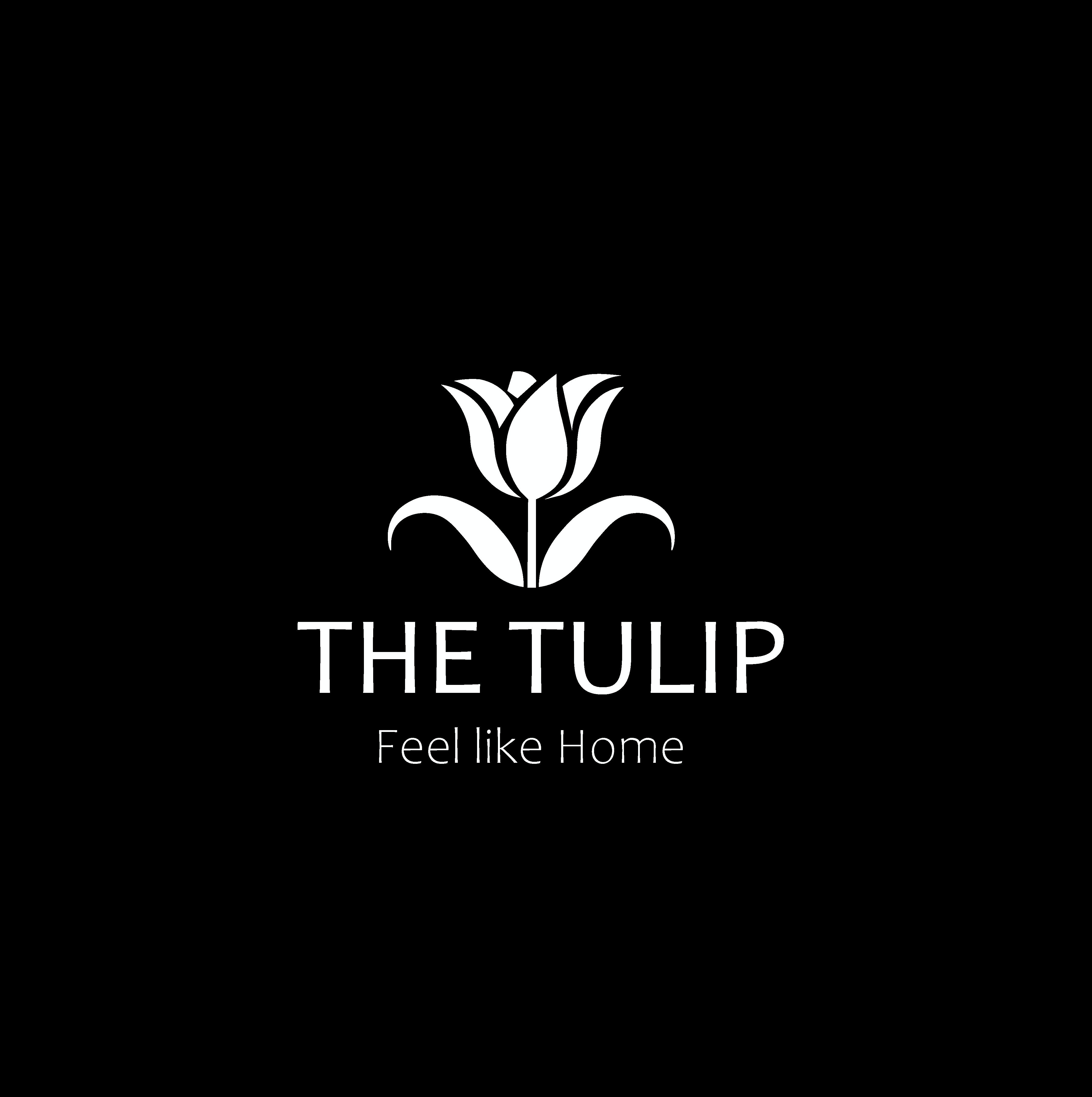
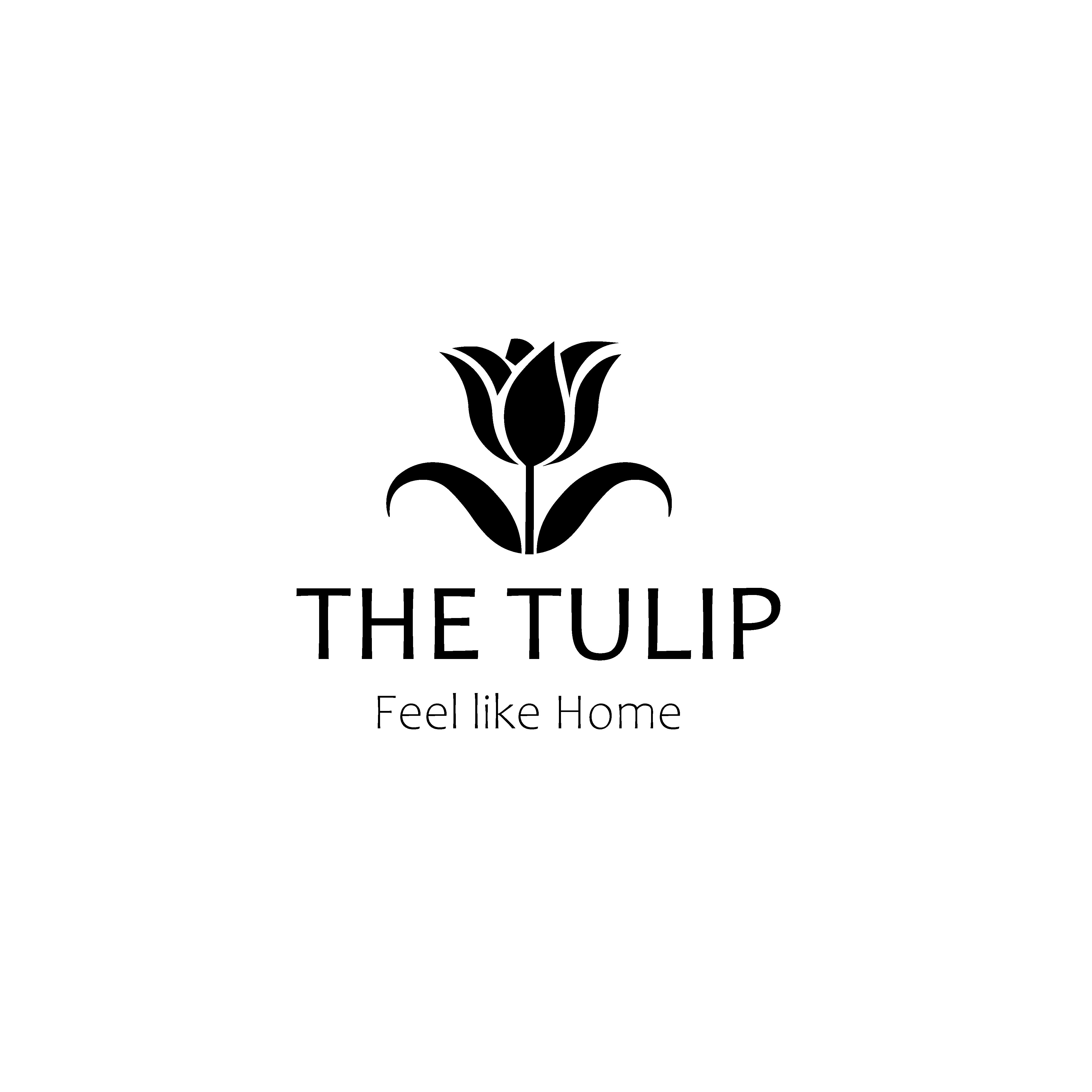
4. Logo Variations
To ensure flexibility across digital and print touchpoints, we created:
A primary logo with full wordmark
A monogram using a custom tulip icon (ideal for favicon, linen tags, or signage)
Horizontal and stacked lockups for different layout needs
5 . Services Delivered
Logo Design & Brand Mark
Typography System
Color Palette & Brand Style Guide
Brand Collateral Mockups (towels, signage, stationery)
6. Tools Used:
Adobe Illustrator · Adobe XD · Procreate (initial sketching)
Result:
The final logo is delicate, distinctive, and versatile, seamlessly blending elegance with approachability. It captures the feeling of walking into a thoughtfully designed space that instantly makes you feel at home.
Testimonial:
“It’s exactly what I had imagined, soft, premium, and inviting. You’ve captured the soul of our brand perfectly.”
— Client, Founder of The Tulip
Challenge:
The client approached Rawdify Digitals with a clear brief: craft a brand identity that reflects the essence of a cozy, welcoming space with a touch of elegance and femininity. The logo needed to evoke a sense of calm, comfort, and personal connection, qualities core to their hospitality promise.
Solution:
To truly capture the spirit of “feel like home,” we followed a strategic yet creative approach grounded in emotional branding:
1. Discovery & Brand Personality Mapping
We began by understanding The Tulip’s target audience, service ethos, and desired perception. The brand was defined by three core traits: warmth, sophistication, and serenity. This helped us anchor the visual tone and symbolism.
2. Concept Development
Several conceptual directions were explored:
Nature & Florals (symbolizing care and softness)
Minimalist Luxury (to position the brand as boutique and refined)
Home Iconography (to subtly reflect comfort and belonging)
After rounds of sketching and mood-boarding, we landed on a concept that combined a stylized tulip flower with soft, flowing lines forming a welcoming shape, almost like open arms or a house silhouette.
3. Typography & Color Palette
Font Choice: A custom serif-logotype was crafted to express trust, grace, and timeless elegance. We paired this with a clean sans-serif tagline to keep the look modern.
Colors: We selected a muted palette of blush pink, warm beige, and soft sage, creating a soothing aesthetic that appeals to both female and family audiences.
The final brand palette communicates comfort without being overly casual—perfect for a premium-yet-homely hospitality brand.
4. Logo Variations
To ensure flexibility across digital and print touchpoints, we created:
A primary logo with full wordmark
A monogram using a custom tulip icon (ideal for favicon, linen tags, or signage)
Horizontal and stacked lockups for different layout needs
5 . Services Delivered
Logo Design & Brand Mark
Typography System
Color Palette & Brand Style Guide
Brand Collateral Mockups (towels, signage, stationery)
6. Tools Used:
Adobe Illustrator · Adobe XD · Procreate (initial sketching)
Result:
The final logo is delicate, distinctive, and versatile, seamlessly blending elegance with approachability. It captures the feeling of walking into a thoughtfully designed space that instantly makes you feel at home.
Testimonial:
“It’s exactly what I had imagined, soft, premium, and inviting. You’ve captured the soul of our brand perfectly.”
— Client, Founder of The Tulip
The Tulip - Feel Like Home is a boutique hospitality brand that blends comfort, elegance, and local charm. Designed to offer travelers a warm, homely experience in stylish accommodations, The Tulip targets modern nomads, families, and professionals seeking a restful yet premium stay.
Challenge:
The client approached Rawdify Digitals with a clear brief: craft a brand identity that reflects the essence of a cozy, welcoming space with a touch of elegance and femininity. The logo needed to evoke a sense of calm, comfort, and personal connection, qualities core to their hospitality promise.
Solution:
To truly capture the spirit of “feel like home,” we followed a strategic yet creative approach grounded in emotional branding:
1. Discovery & Brand Personality Mapping
We began by understanding The Tulip’s target audience, service ethos, and desired perception. The brand was defined by three core traits: warmth, sophistication, and serenity. This helped us anchor the visual tone and symbolism.
2. Concept Development
Several conceptual directions were explored:
Nature & Florals (symbolizing care and softness)
Minimalist Luxury (to position the brand as boutique and refined)
Home Iconography (to subtly reflect comfort and belonging)
After rounds of sketching and mood-boarding, we landed on a concept that combined a stylized tulip flower with soft, flowing lines forming a welcoming shape, almost like open arms or a house silhouette.
3. Typography & Color Palette
Font Choice: A custom serif-logotype was crafted to express trust, grace, and timeless elegance. We paired this with a clean sans-serif tagline to keep the look modern.
Colors: We selected a muted palette of blush pink, warm beige, and soft sage, creating a soothing aesthetic that appeals to both female and family audiences.
The final brand palette communicates comfort without being overly casual—perfect for a premium-yet-homely hospitality brand.
4. Logo Variations
To ensure flexibility across digital and print touchpoints, we created:
A primary logo with full wordmark
A monogram using a custom tulip icon (ideal for favicon, linen tags, or signage)
Horizontal and stacked lockups for different layout needs
5 . Services Delivered
Logo Design & Brand Mark
Typography System
Color Palette & Brand Style Guide
Brand Collateral Mockups (towels, signage, stationery)
6. Tools Used:
Adobe Illustrator · Adobe XD · Procreate (initial sketching)
Result:
The final logo is delicate, distinctive, and versatile, seamlessly blending elegance with approachability. It captures the feeling of walking into a thoughtfully designed space that instantly makes you feel at home.
Testimonial:
“It’s exactly what I had imagined, soft, premium, and inviting. You’ve captured the soul of our brand perfectly.”
— Client, Founder of The Tulip
Other Projects
Other Case Studies
Check our other project case studies with detailed explanations
Other Projects
Other Case Studies
Check our other project case studies with detailed explanations


Other Projects
Other Case Studies
Check our other project case studies with detailed explanations